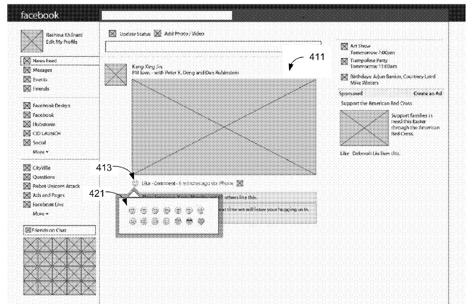
While the Facebook’s emoji reaction patents go back to 2013, however, a recent document filed on December 23, 2014 explains how the tool may look like on the social network. Users may now have the option to choose from a range of emoji that would best describe their reaction, which can used as an alternative to the usual Like thumbs up button.
Currently, Slack’s emoji reaction uses icons found on iOS/Mac OS, and allows users to choose from any of the hundred options available at present. According to the subject matter, it allows for a more flexible and comical way to reply to posts. The patent filing shows a Emoji Selector button next to the Like and Comment buttons on Facebook posts. When clicked, it reveals a small set selectable Emoji, with 5 in one concept drawing and 14 in another. Once tapped, a thumbnail of the sender’s face with their chosen emoji overlaid appears in a row above the post’s Like count and Comment reel. Even though Facebook has its own set of emoji art, however, going by the patent explanation, it could give people a universally understandable way to instantly share emotions beyond Likes without overly cluttering its interface. In fact, Facebook already offers ways to share Emoji-based “Feeling” status updates. This would just be extending Emoji sharing into a feedback format. The mockups below indicate that user icons may also show next to the emoji reactions to display actually who ‘liked’ or ’empathized’ with a post. That sounds familiar, as the same was viewed before with Path‘s ‘Emotions’ button that has been around since 2011. Facebook recently tested using Path-style flyout buttons for posting statuses. Facebook turned the Send button on Messenger into a Thumbs Up back in 2013, if you had not written any text just like Path’s Check Mark. While the final design could certainly be different, it does look like Facebook sees merit in providing a limited selection of emoji reactions, likely including a sad face, as an answer to requests for a Dislike button.
